Mobile-first design in SwiftUI for data visualization
Note: This is an exploratory design that might not meet all the requirements for accessibility.
Introduction
WTF: What's this For?
In this project, I plugged a simplified data model, data set and control logic into a SwiftUI design system for a marketplace, partially inspired by Axie Infinity. The final app brings the design system to life as a living and testable product that can support complex user flows and information architecture.
In this Swift User Interface, we can reconfigure and test:
- 2 color sets
- 6 layouts for viewing and exploring information
- 3 different UI textures
and each permutation resides in the same app. The User Interface is available for public testing on iOS here
I found through research that everyday users enjoy colorful user interfaces. Designers though are cautious in their use of color because they are very aware of the delight (and drama) that color is responsible for. It is well known that warm colors appear closer, cool colors more distant, red & blue together spark emotions and yellow, being the center wavelength, just hits us smack between the eyes.
The programming language R gives access to several color-blind friendly maps for visualizing and interpreting complex data.

There is magic to color that goes beyond aesthetics though. Wavelength division multiplexing (WDM) is a technology where large quantities of data are split into different light channels and transmitted simultaneously (the fiber bandwidth is increased). This can perhaps be observed physically as some research suggests that lightly tinted glasses of different colors can enhance reduce tunneling and depth perception.
UI Frameworks for native app development
Native Apps provide the best user experience, especially when accessing hardware and harnessing features such as AR. Native development is known to be expensive but the modern declarative frameworks such as SwiftUI for iOS and Jetpack Compose for Android make it building beautiful high quality user interfaces and apps more efficient.
In addition, KMP seems like a promising architecture where the SwiftUI or Jetpack Compose UI views can be driven by the same backend and logic. Just a note, this is a very simplified explanation of KMP. I am not a KMP expert so I won't go further into this :D
Using Data in the First Prototype
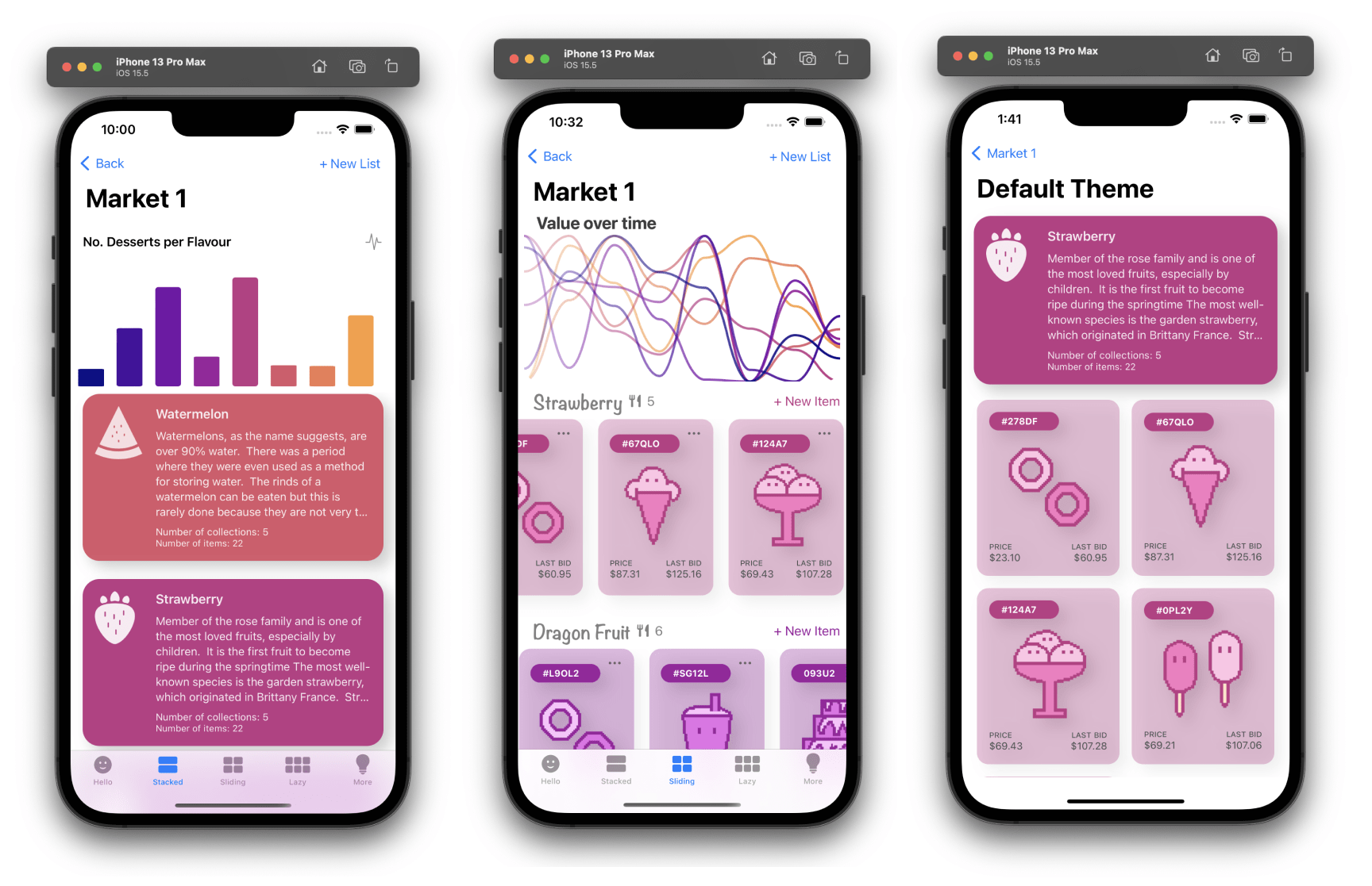
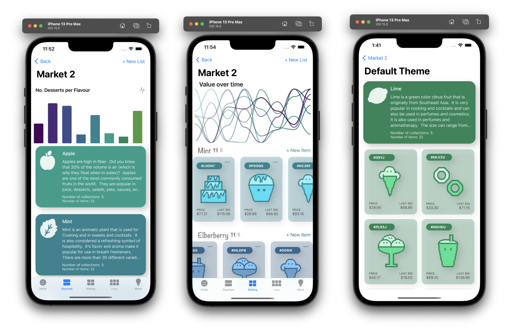
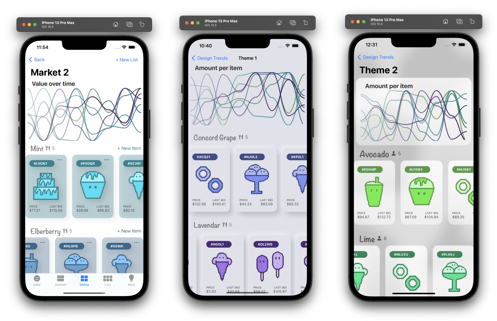
Market Structure
The data structure of this app has a steep hierarchy but overall is simple. We can create make multiple markets, where each market has a set of flavors (or categories) and each flavor can have a set of desserts (or items). I thought I'd give my code a little character here :D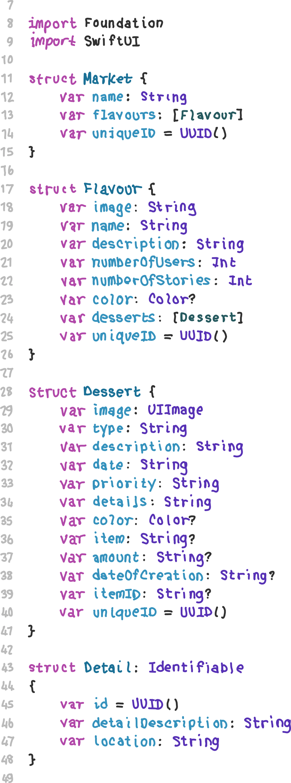
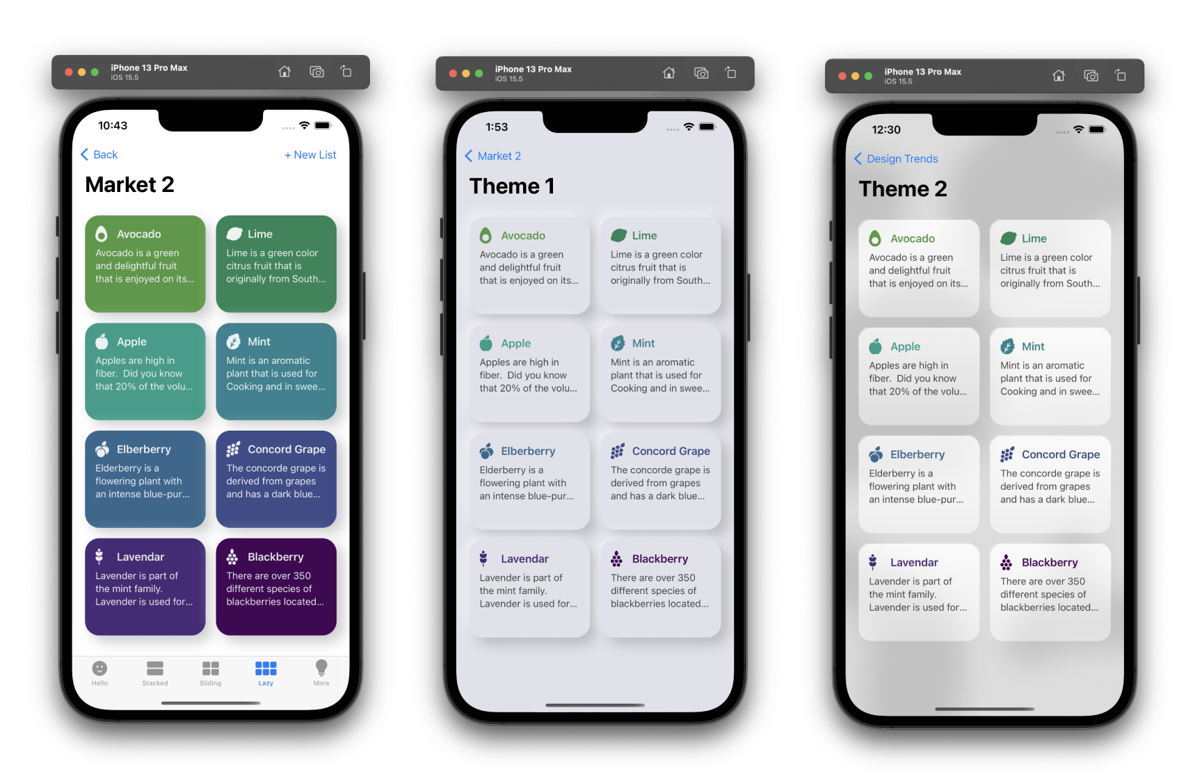
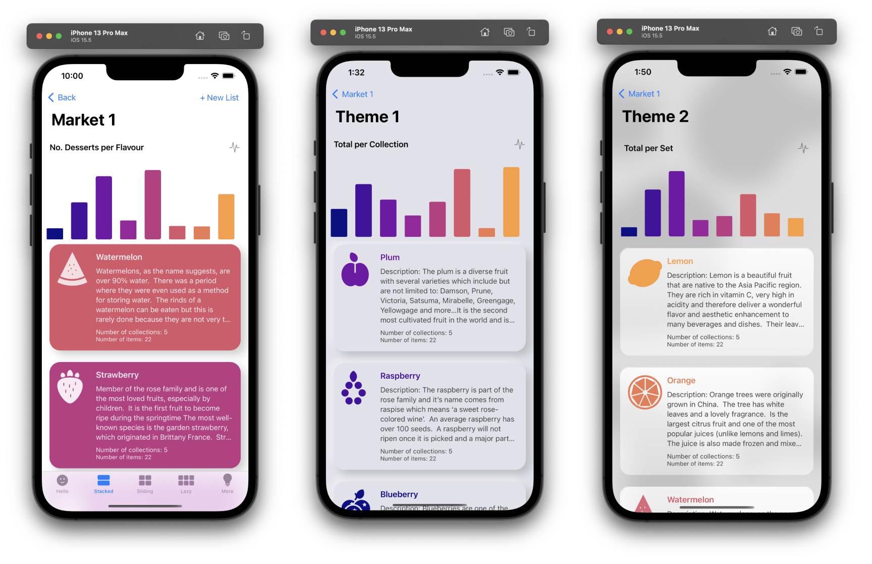
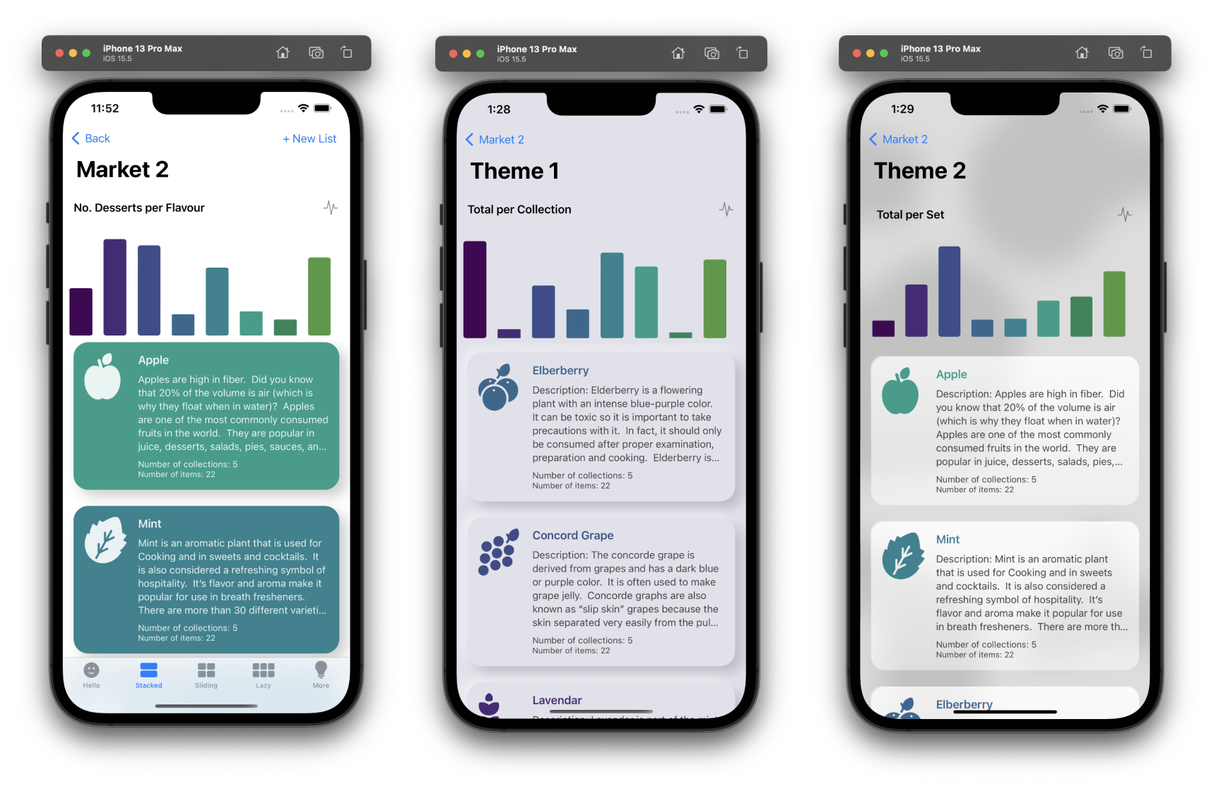
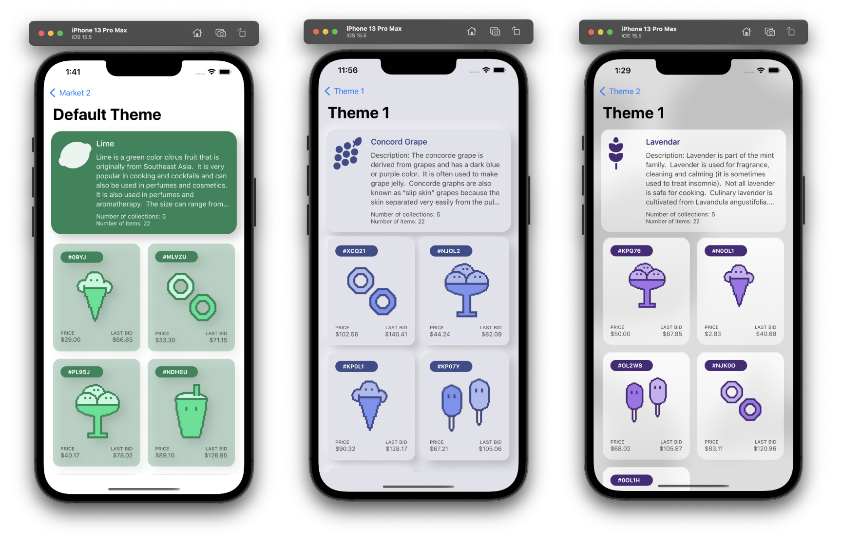
The data set is provided early in the prototyping stage to inform and guide the user interface design. We are able to see how the data appears on different textures
- Flat
- Neumorphic
- Glass
Data Set
I placed the sample data in an ObservableObject class and used the @Published property wrapper. It is called ObservableObject because SwiftUI monitors the ObservableObject which in turn will announce when changes to the data set occur.
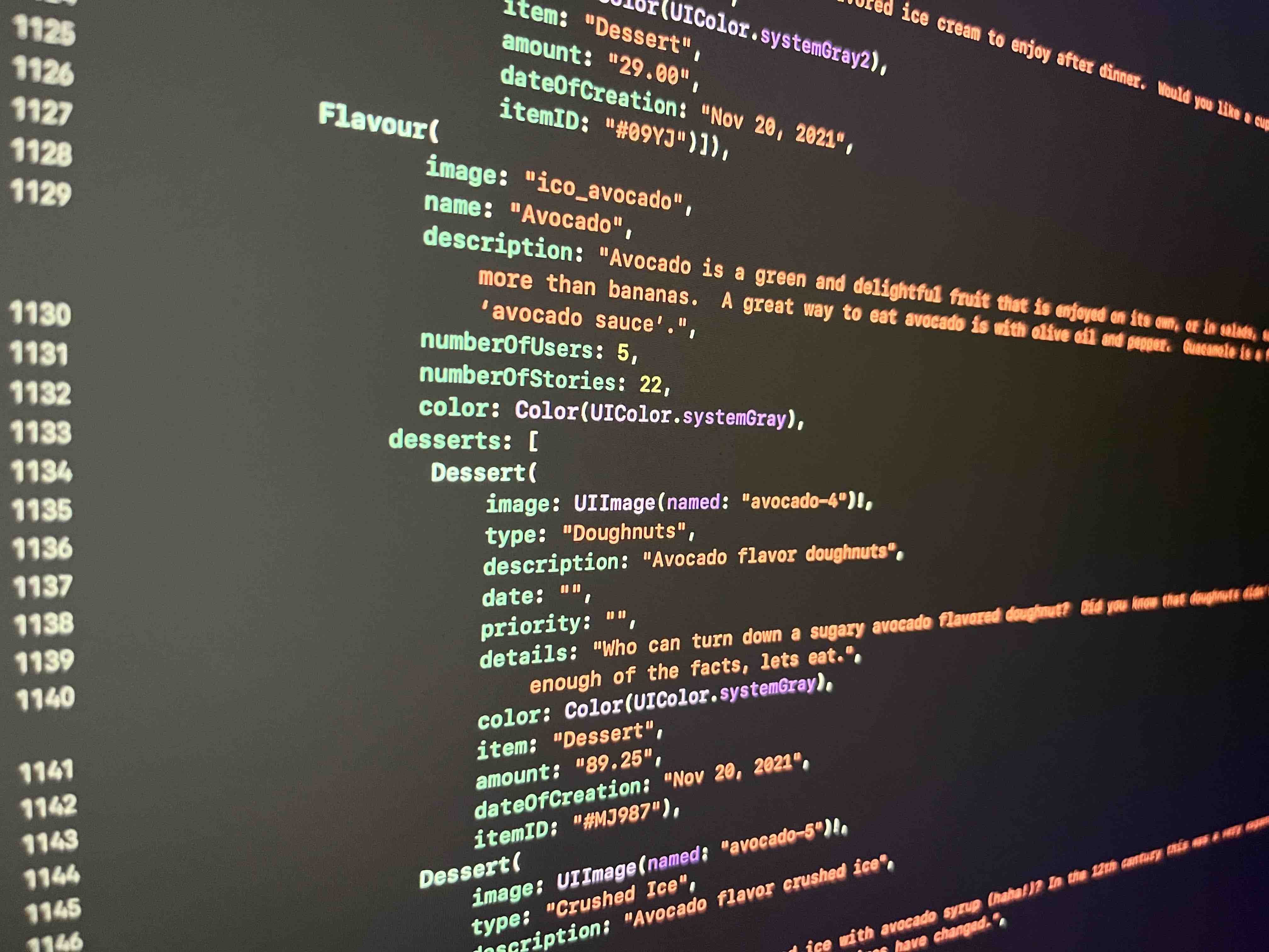
This was a lot of copy to write, 1200 Swift lines of copy in fact. And in making this I have learned a lot of fun facts about fruits and desserts.
Icons
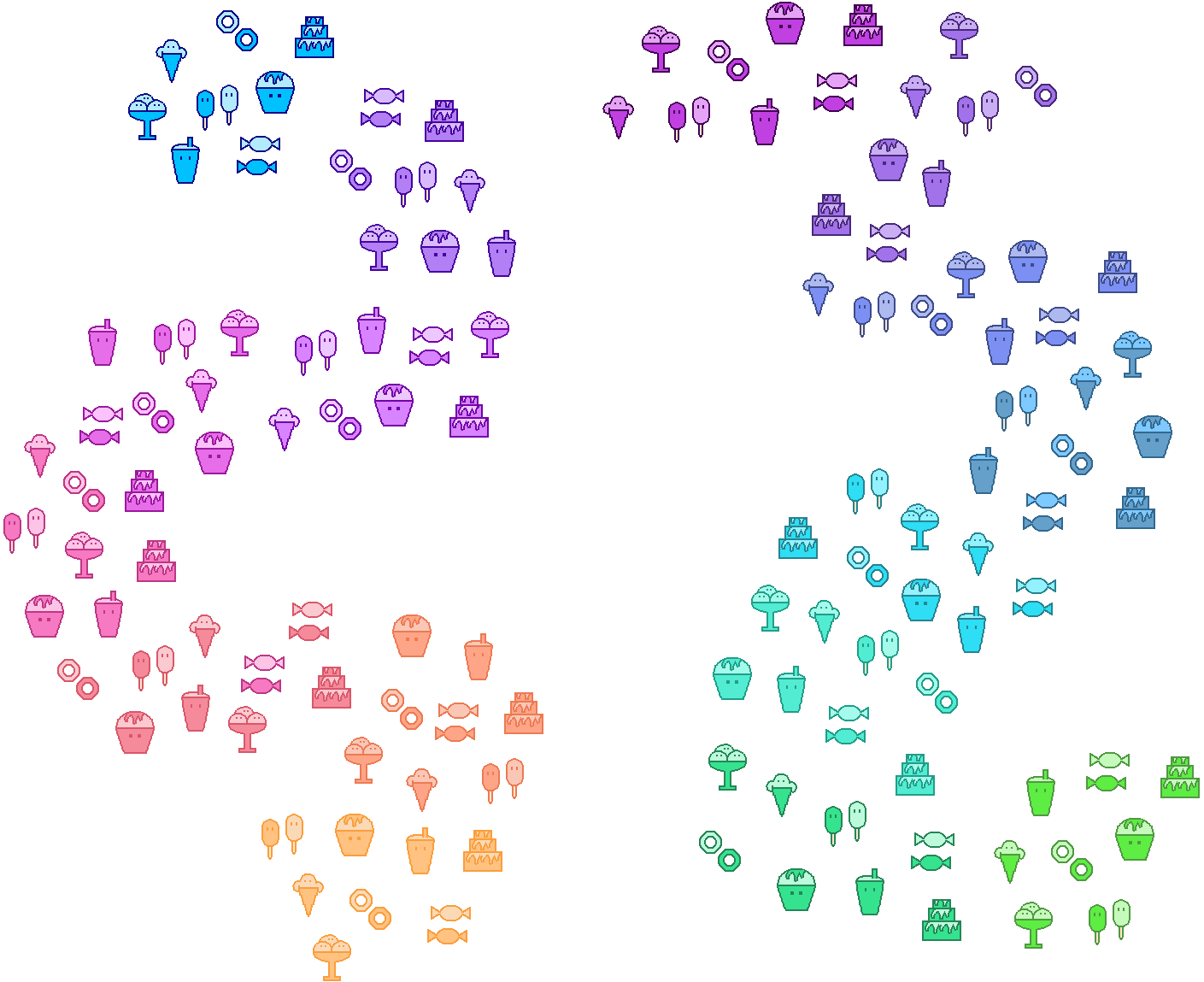
Next comes icons. This is the first iteration of icons for each flavor (created in Figma). There is still more work to be done in order to make them look more consistent and like a family but I hope this is a good start.
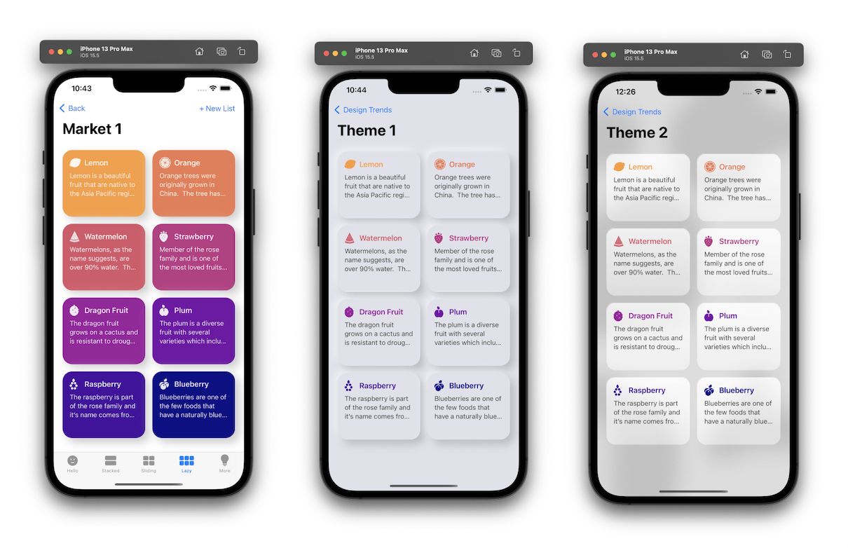
Warm color flavors
The warm colors are Lemon, Orange, Watermelon, Strawberry, Dragon Fruit, Plum, Raspberry, Blueberry
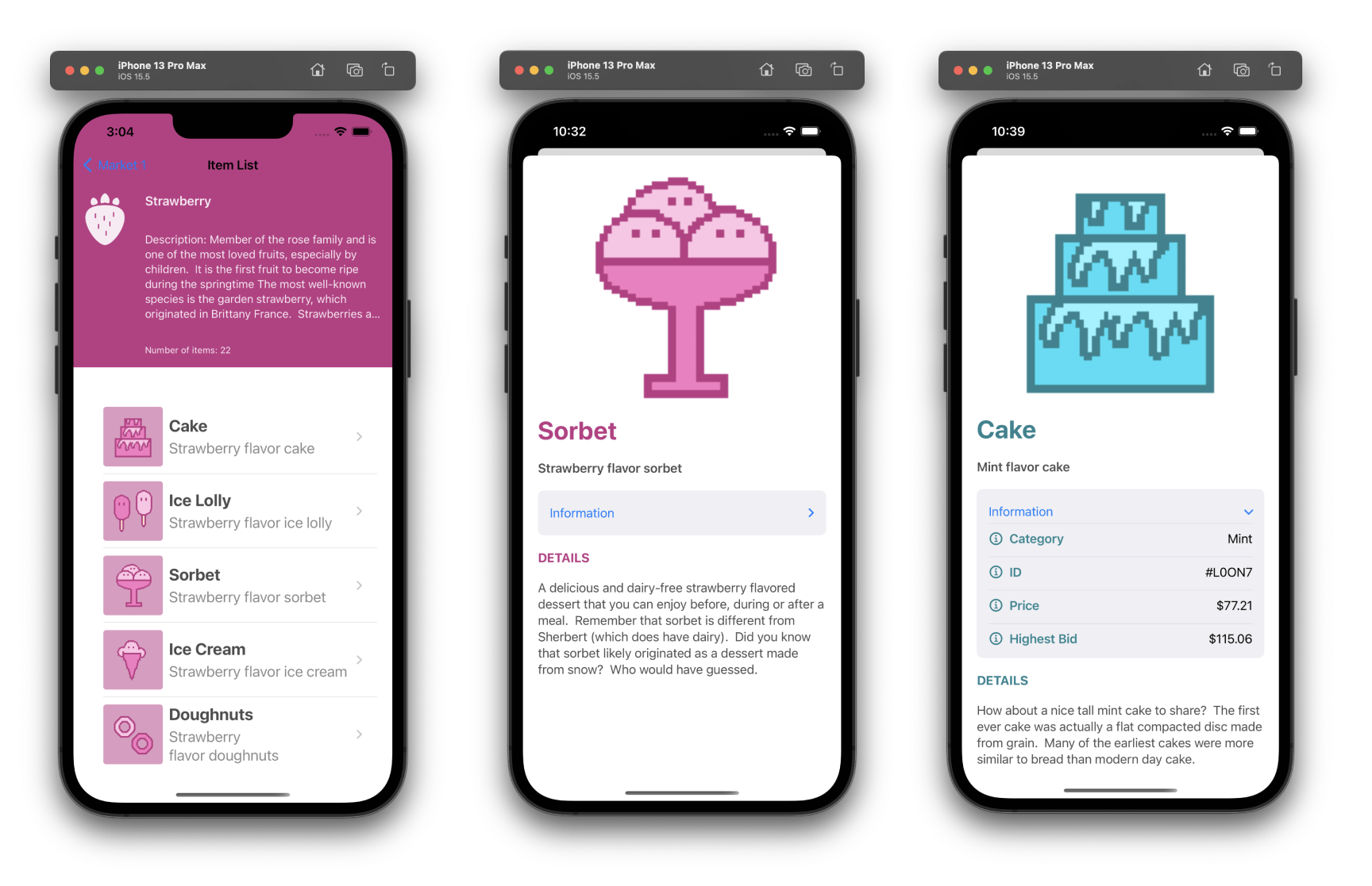
This layout allows one to see, for one market, how many desserts there are for each flavor and a description of each flavor.
Cool color flavors
The cool color flavors are Avocado, Lime, Apple, Mint, Elderberry, Concord Grape, Lavendar, Blackberry
Desserts
I created the pixel desserts in Figma. They are not the greatest but were quick to make and pretty funny to me. It is known that faces attract more attention than pain objects so I gave each dessert little eyes.
- Sorbet
- Ice Cream
- Crushed Ice
- Doughnuts
- Smoothie
- Candy
- Cake
Figma is actually not an optimal tool for making pixel art but throughout these projects I have been accumulating too many tools and subscriptions so I decided to cut down.

For the prototype data set, I kept things simple and used the same set of desserts for each flavor. Again this is just a sample data set so they are not perfect (I spent more time actually getting each svg into Xcode)
Exploring the Entire Market
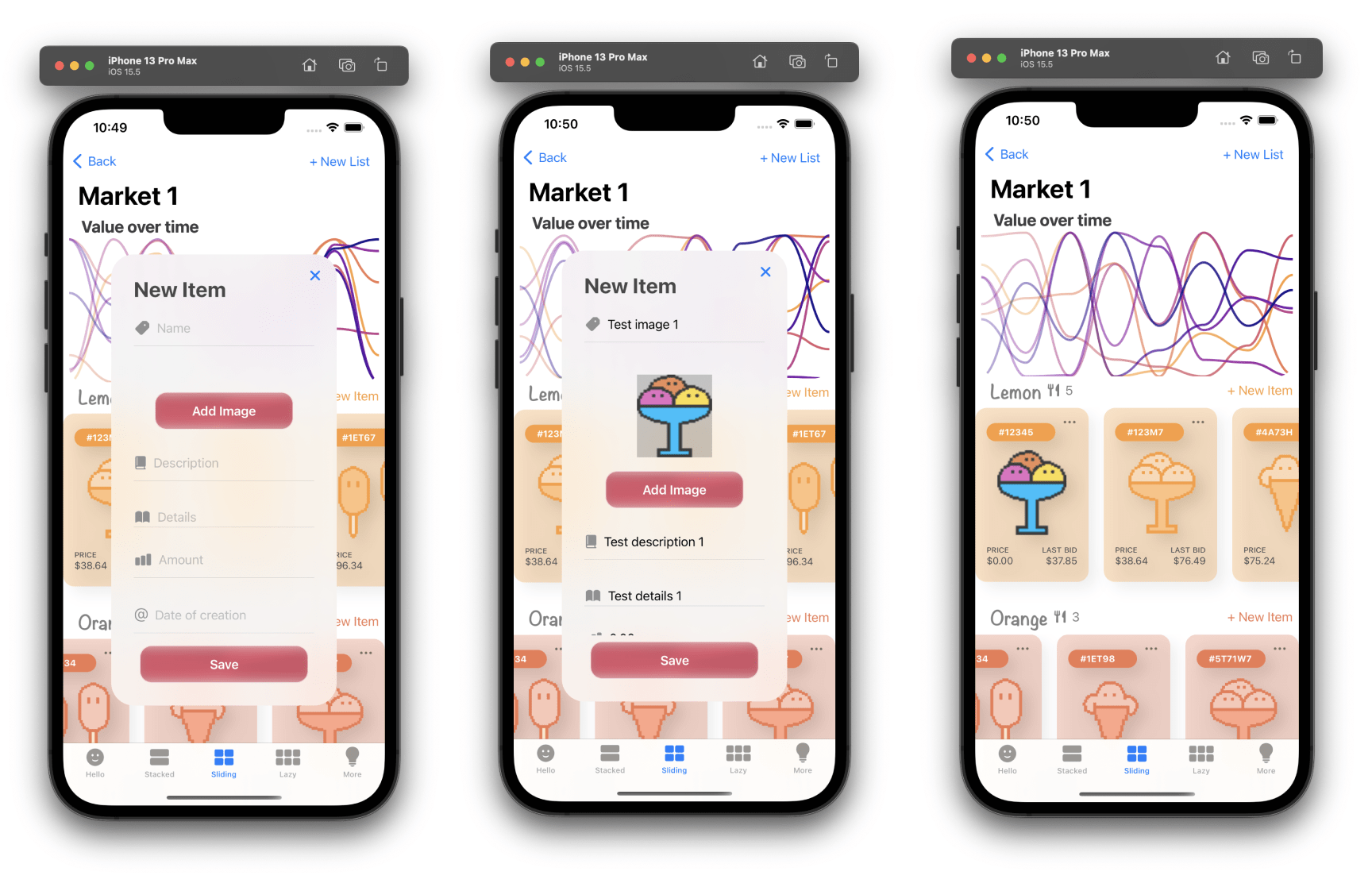
The carousel allows you to visualize and explore, on one screen, all fruits within each flavor for one market. This was the most complicated layout to implement because it contained data and nested scroll views with headers.
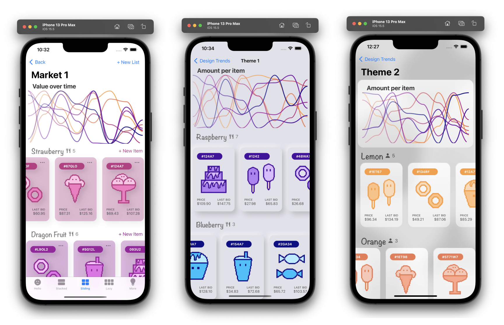
This view will also allow the user to add new desserts to any flavor. This is discussed in more detail at the very end.
A Pause
Hello there :)
I hope you are having a perfect day!

Lazy Grid
This layout was a great opportunity to explore the benefits of the SwiftUI lazy grid. Lazygrid is a really cool SwifUI feature that adds flexibility to your grids, letting them automatically reconfigure based on the view sizes and your specifications. From a UI perspective, the layout allows the user to comfortably explore the desserts within one specific flavor.
I could elaborate more on this but, I'm feeling lazy at the moment.
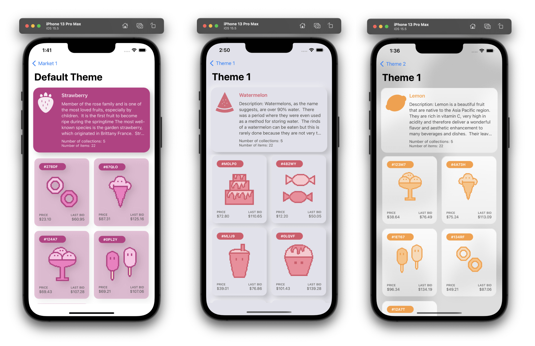
Navigating to details
An Acknowledgement
I learned iOS development right before the COVID-19 pandemic started. Part of my background was in Computational Electromagnetics but I had not touched this since my academic years and really missed it. After going through Udacity to learn the concepts of UIKit, networking, native authentication and core data, I transitioned to SwiftUI thanks to Meng To from Design+Code and Robert Petras from the Credo Academy who taught me how to create this lovely detailed view here.
I know I have a little issue with the blue back-navigation over the pink (will sort that out later).
Forms
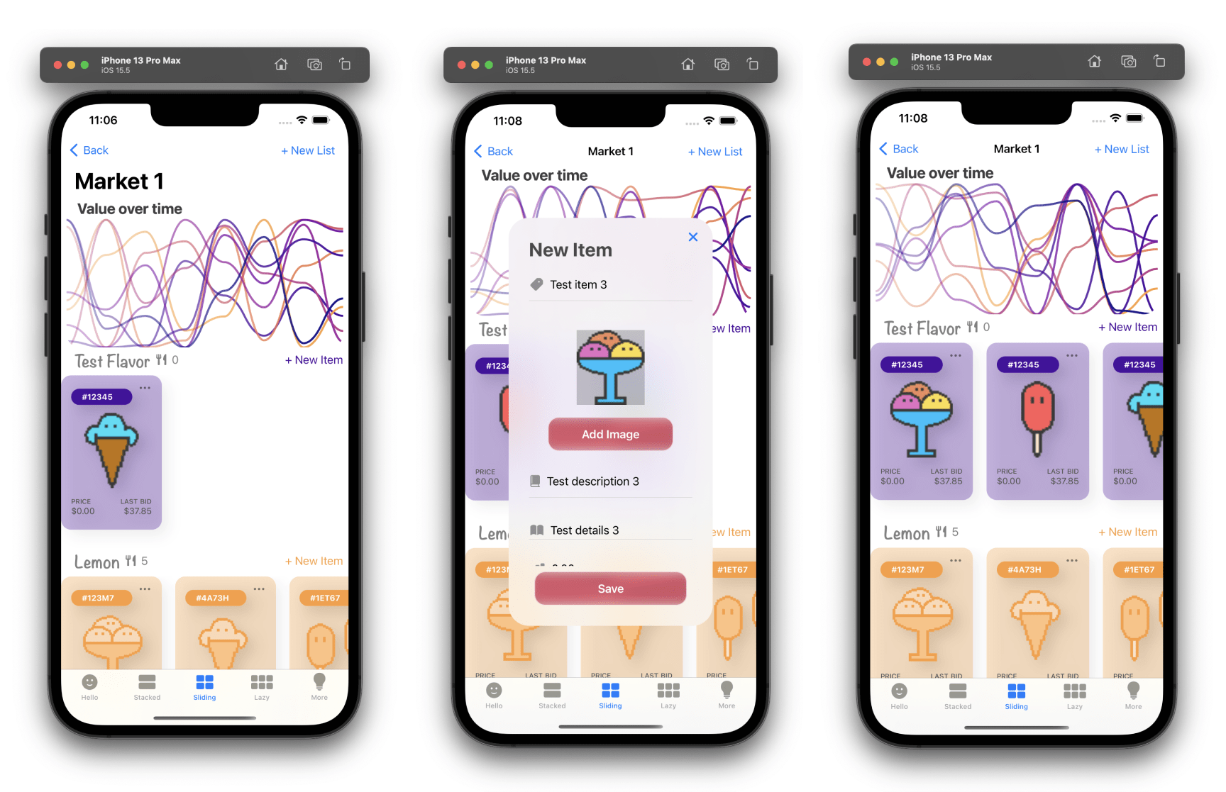
Adding new desserts
In this app, the user can add or remove desserts. Designing and implementing a model form takes time. For this first iteration, I decided to keep it simple because it took awhile for me to get the prototype of the controller logic working properly.
Adding new flavors
In addition to adding desserts, the user can add new flavours as well. And within the new flavor, they can add more desserts.
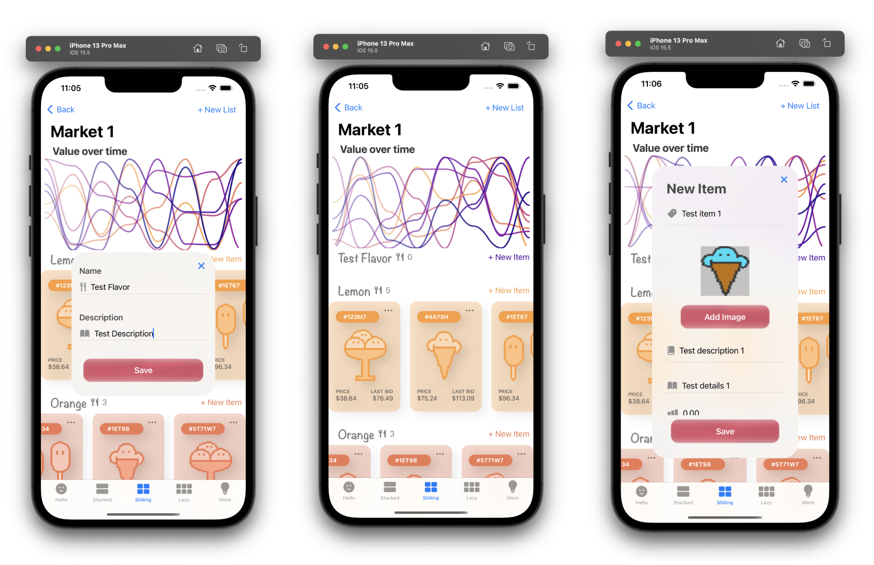
When testing this UI you will notice that each new dessert appears very instantly. For future iterations I am planning to add animations to make the data updates and transitions more smooth and engaging.
What's next?
Pixel Draw Tool
The Hello screen will be replaced with a pixel drawing tool so that the user can draw their items in the same app.