Data Visualization
Redrawing Adobe XD Charts in Figma
I am excited to share some data chart templates that I have made over time in Adobe XD that I am currently redrawing in Figma.
Dashboards can take a long time to build, which is why pins are very useful. This section will be updated regularly and soon contain 100 charts.
Notice I like to use large axis-labels.
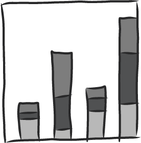
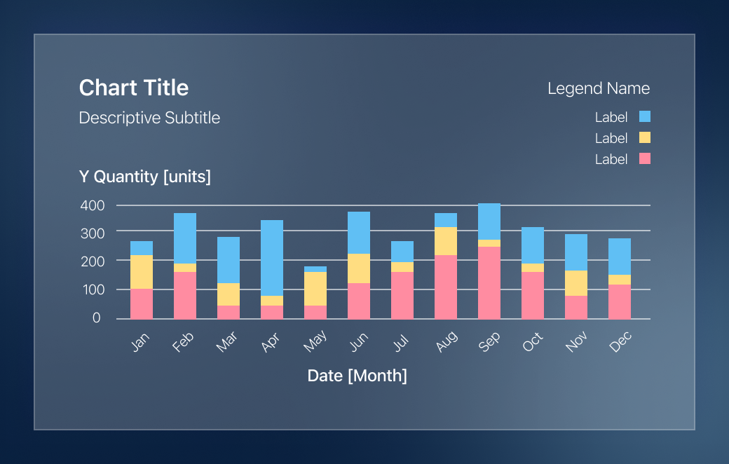
Pin 1
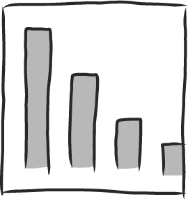
Stacked Bar Chart
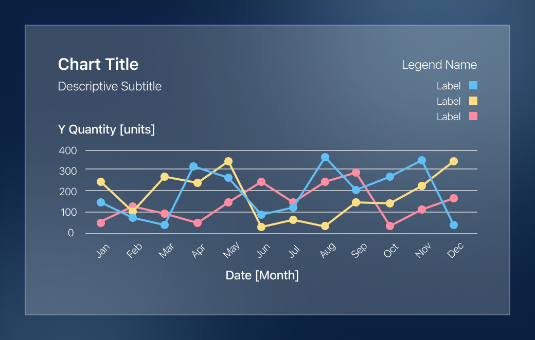
Pin 2
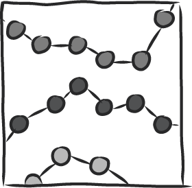
Line Chart
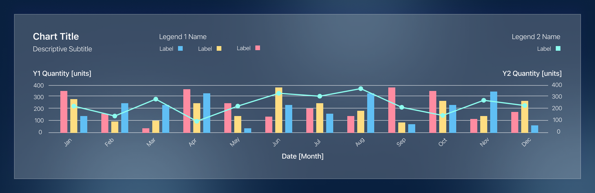
Pin 3
Stacked Bar Chart and Line Chart with Dual Axis
Pin 4
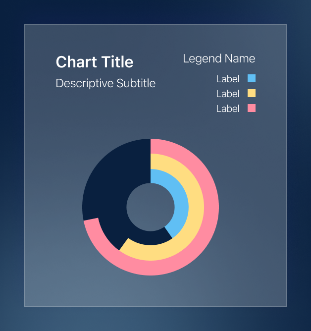
Stacked Circular Bar Chart
Pin 5
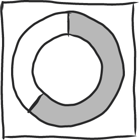
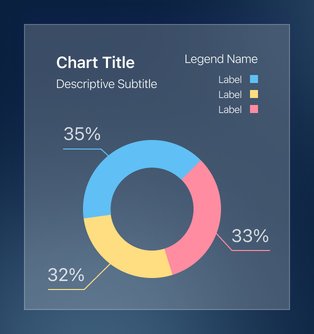
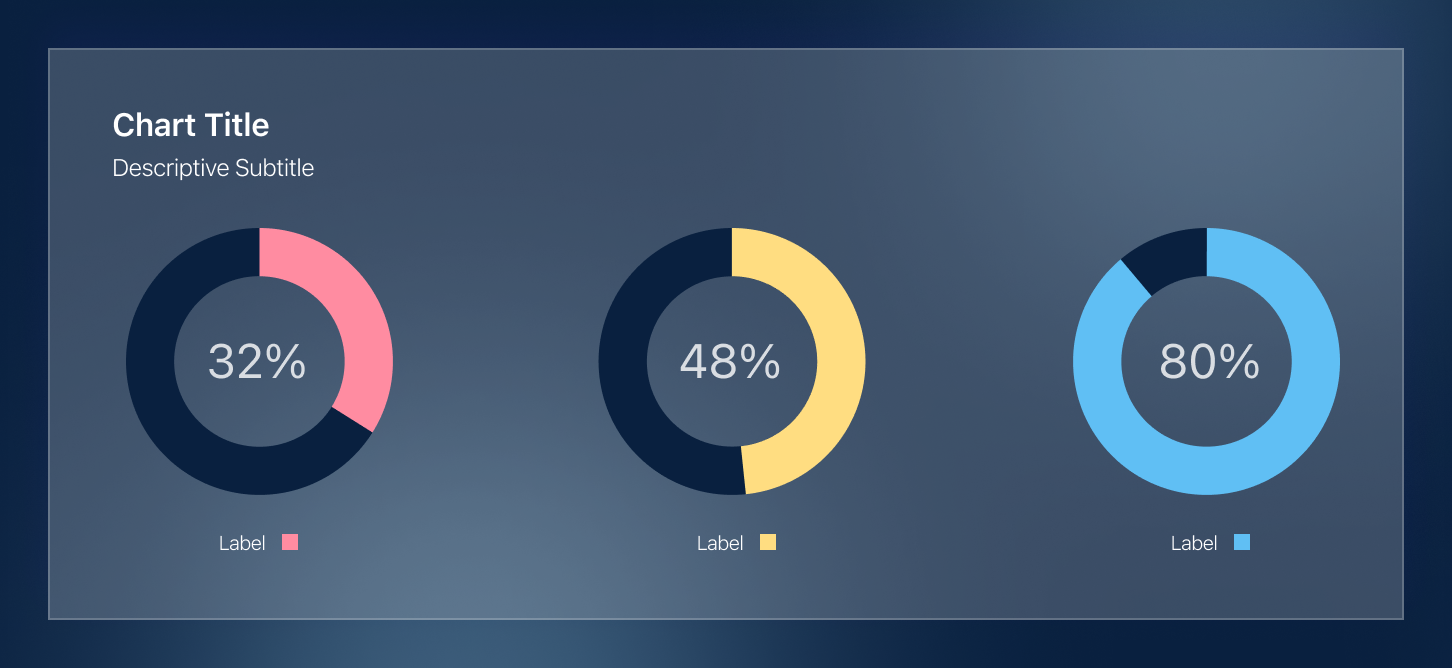
Circular Bar Charts
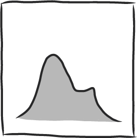
Pin 6
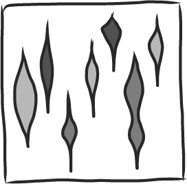
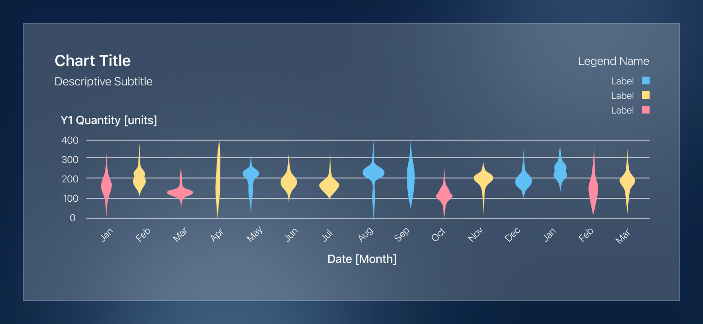
Violin Charts
Pin 7
Circular Grouped Bar Chart
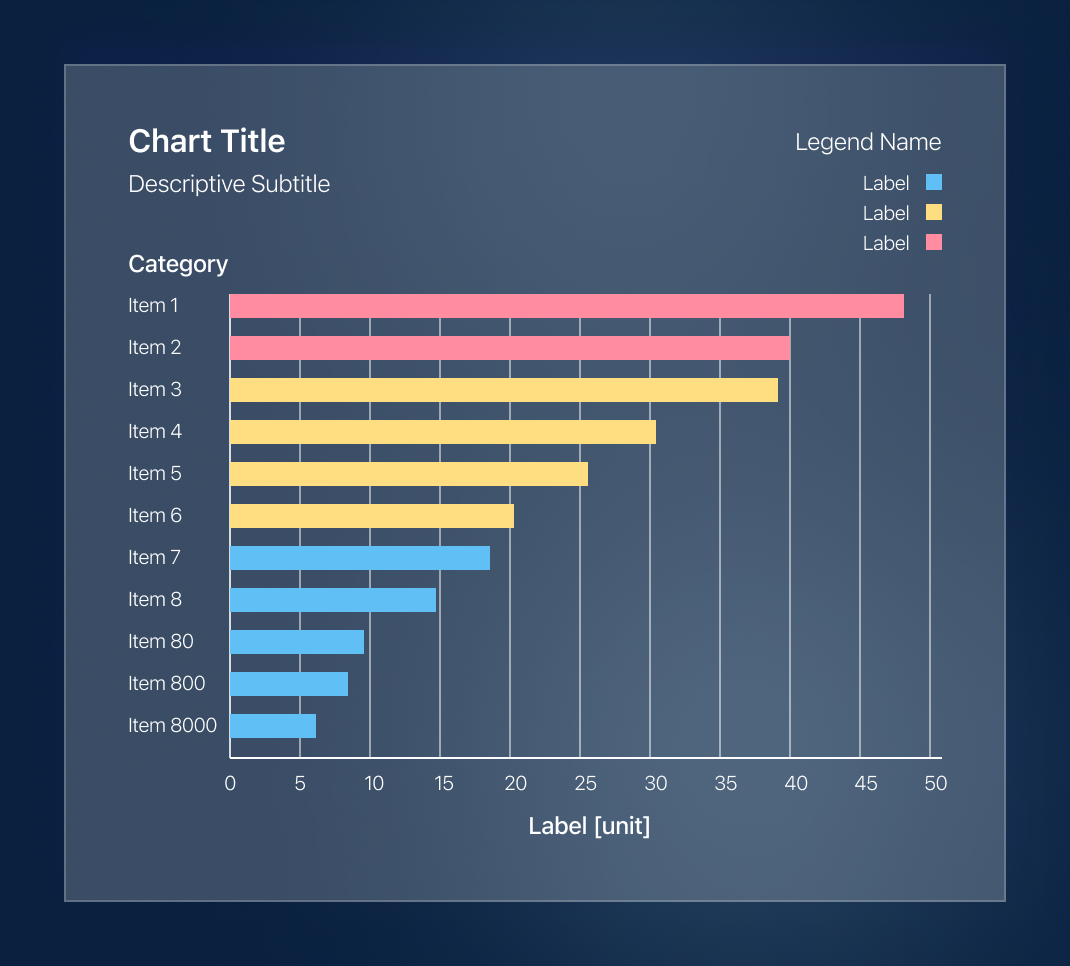
Pin 8
Horizontal Bar Chart (popular for feature importance)
Pin 9
Bubble Chart
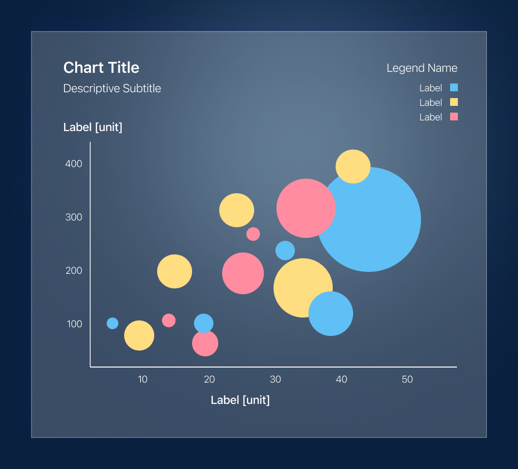
Chart Library
These data charts, as crooked as they are, look amazing in Balsamiq dashboard wireframes. Feel free to rech out to me if you would like me to send you a copy of these (and more).